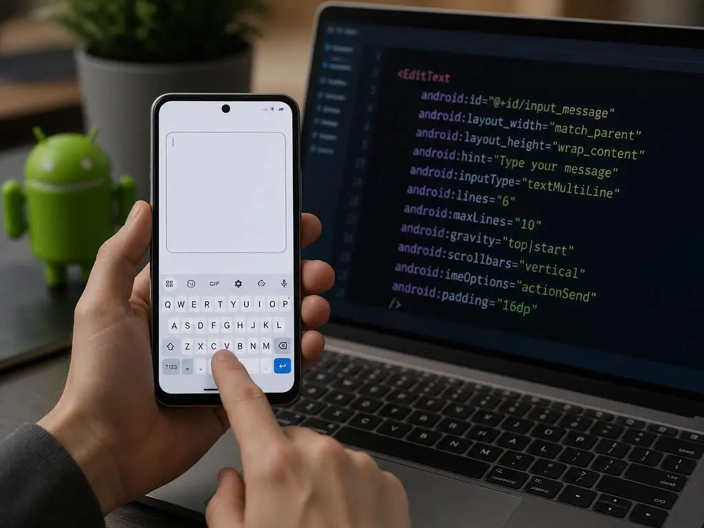
Developing interactive interfaces requires attention to text inputs. The android edittext multiline component is essential for receiving long messages or feedback within mobile applications. However, setting up this component often introduces unexpected layout bugs and keyboard styling issues that frustrate developers and degrade the overall quality of your mobile application.
Handling long-form text entry requires a deep understanding of standard XML attributes and focus management. If you want to solve common input bugs and prevent soft keyboard overlapping, you must configure your interface fields properly. Let us explore the best techniques to optimize your responsive inputs and elevate your mobile development.
Configuring basic Android multiline text components
Setting up a text field to accept multiple lines of text requires defining the proper layout properties in your XML code. By default, a standard text input field is optimized for single-line entry like usernames or passwords. To change this behavior, you must adjust specific attributes to allow text wrapping inside the widget.
The primary attribute to modify is the input type, which controls how the system displays the keyboard and handles user input. Setting this property to textMultiLine tells the system to support paragraph entries. This change enables the enter key to insert line breaks rather than submitting the form immediately.
Additionally, developers should declare the initial lines visible on the screen to prevent sudden layout jumps when typing. Specifying a minimum height ensures the input looks natural and inviting before the user begins typing. This creates a balanced visual layout that naturally encourages user interaction within your application.
💡 XML Configuration Tip
Always set android:inputType="textMultiLine" and android:gravity="top|start" together to ensure text starts from the upper-left corner instead of centering vertically.
Handling Android EditText multiline scroll issues
Why does vertical text scrolling fail by default?
When users enter long paragraphs, the text will eventually exceed the physical boundaries of the input field. Without proper configuration, the hidden content becomes inaccessible, which drastically hurts the writing experience. To fix this, you must configure the vertical scrolling behavior inside your layout to allow smooth navigation.
Enabling scrollbars is a vital step toward creating a responsive multiline input field inside scrollable parent containers. You should declare vertical scrollbars in your XML definition to give users a visual cue that more content exists. This visual indicator helps users understand they can swipe to read their entire message.
How to resolve scroll conflicts with parent views
Furthermore, you must manage touch events programmatically when the input resides inside a ScrollView component. Parent scroll views often intercept touch gestures, preventing the input field from scrolling its internal text. Implementing a custom touch listener resolves this conflict by requesting the parent container to disallow interception.
⚠️ ScrollView Conflict Warning
If your text input is nested inside a scrollable layout, use view.getParent().requestDisallowInterceptTouchEvent(true) on touch events to restore proper inner scrolling.
Managing keyboard actions for paragraph entry
The soft keyboard plays a significant role in how users perceive your form layouts on mobile devices. Standard single-line fields usually show a Done or Next button on the virtual keyboard to move focus. For multiline inputs, however, users expect the enter key to insert new lines of text instead.
This behavior is controlled by the input method editor options defined in your layout resources. By default, enabling multiline inputs changes the action button to a carriage return icon automatically. This ensures that users can format their messages into readable paragraphs without any unexpected layout navigation occurring.
However, there are times when you want to show a custom action while still allowing multiple text lines. Developers must balance these requirements by overriding the keyboard listener programmatically to handle specific key events. This balance is crucial for maintaining an intuitive input flow without sacrificing formatting capability.
Controlling text field height and line expansion
Allowing an input field to grow indefinitely can ruin your application layout and push other essential views off screen. It is important to define boundaries for the dynamic growth of your input container. Setting a maximum limit of visible lines ensures your user interface remains clean and predictable.
By configuring both minimum and maximum lines, you can easily implement a dynamic height adjustment system. The input field will start at a compact size and expand naturally as the user types more paragraphs. Once the maximum limit is reached, the input stops growing and enables internal vertical scrolling.
Managing this layout behavior is highly beneficial when you are focusing on scaling enterprise performance inside dense administrative portals. Well-bounded input fields prevent layout crashes and ensure that primary action buttons remain visible to users. This programmatic structure keeps your screens stable even during heavy data entry sessions.
Solving text alignment and gravity issues
A common visual bug in multiline inputs is the vertical centering of placeholder text and cursor lines. By default, Android vertically centers text inside inputs that have a larger height than their default content. This layout behavior looks extremely unprofessional when designing clean, form-based layouts for users.
To fix this layout alignment issue, you must explicitly set the gravity property to top and start. This property configuration forces the cursor and any hint text to begin at the upper-left corner of the input. Now, the typing experience feels natural and aligns perfectly with standard document layouts.
This adjustment is especially critical when you build modern websites or mobile apps to grow your online revenue through interactive customer forms. Clean form alignments directly reduce user fatigue and increase completion rates on registration pages. Polishing these small layout details significantly impacts your software’s overall visual credibility.
⚙️ Alignment Checklist
- Set
android:gravity="top|start"to fix vertical centering. - Use padding instead of margins for internal touch targets.
- Ensure the hint text matches the aligned cursor position.
- Test alignment with different screen resolutions and densities.
Designing a responsive layout for text input
Responsive design is not limited to web pages; mobile input fields must also adapt to changing screen orientations. A multiline field needs to adjust its width and height dynamically depending on whether the device is held vertically or horizontally. Using relative layouts or constraint layouts helps achieve this structural elasticity.
When the software keyboard appears, it occupies a significant portion of the screen, leaving very little space for input. You must configure your manifest settings to resize your layouts instead of panning them out of view. This guarantees that your input field remains fully visible and editable during keyboard interactions.
In addition, using weight-based dimensions in linear layouts can help distribute screen space more evenly across input widgets. This layout strategy ensures that label views, descriptive texts, and action buttons scale proportionately on smaller devices. Proper structural scaling prevents UI elements from overlapping and breaking your app design.
Setting input constraints and character limits
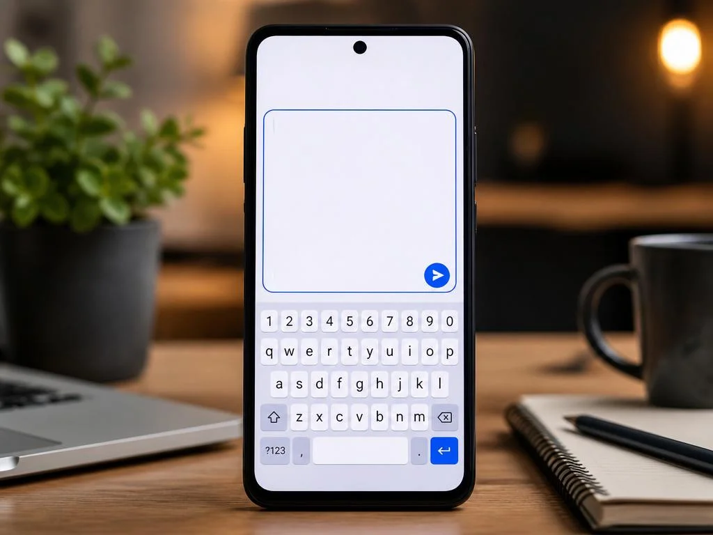
While multiline fields are intended for longer texts, you still need to enforce limits to protect your database. Allowing unlimited character inputs can lead to severe performance slowdowns or server validation failures during data submission. You must implement robust constraint mechanisms to handle excessive text inputs gracefully.
You can define character limitations easily using built-in input filters in your application layout files. However, displaying a simple counter below the text field is highly recommended to keep users informed of their remaining limit. This visual counter prevents unexpected truncations and improves the overall transparency of your forms.
Implementing clear constraints is a fundamental step toward maximizing your impact when deploying clean user portals or public terminal applications. Well-designed constraints protect backend services from processing bloated payloads while guiding users to write concise and readable messages. This practice maintains data integrity across your entire mobile infrastructure.
| Constraint Type | XML Attribute | User Experience Impact |
|---|---|---|
| Max Lines | android:maxLines |
Limits vertical size but allows endless text scrolling. |
| Max Length | android:maxLength |
Hard stops typing once the character limit is hit. |
Optimizing rendering performance for long texts
Rendering text in real-time can become resource-intensive as the size of the entered document increases. Every time a user presses a key, the system must recalculate layout spans, draw characters, and update cursor positions. For complex screens, these heavy calculations can cause visible frame drops and lag.
To maintain 60 frames per second, you must optimize your text layouts and avoid redundant layout invalidations. Using simple background drawables and disabling heavy real-time formatting spans can significantly reduce the CPU rendering workload. This optimization keeps the typing experience incredibly smooth and responsive, even on older mobile devices.
These performance considerations are vital when you plan to unlock growth with modern rendering architectures in demanding retail environments. Minimizing redraw cycles preserves battery life and ensures a fluid interface across all enterprise mobile touchpoints. Fast, responsive inputs keep users engaged and prevent application frustration.
🚀 Key Optimization Takeaways
Keep layouts simple: Avoid nesting multiline text fields inside deeply nested relative layouts.
Disable costly listeners: Do not perform heavy database queries inside text changed loops.
Optimize drawables: Use flat background colors instead of complex, multi-layered vector graphics.
Troubleshooting common multiline EditText bugs
How to prevent bottom text clipping on low densities
Even with careful setup, developers frequently run into irritating bugs during integration tests. One common issue is text clipping, where the bottom of lower-case letters gets chopped off near the field boundaries. This usually happens when layout paddings are too tight or line spacing multipliers are set incorrectly.
To bypass layout errors, always implement appropriate spacing inside your design layouts. Adding some light padding at the bottom of the container gives the text elements enough room to draw fully. This tiny layout adjustment eliminates rendering bugs and ensures all standard font styles are readable.
How to dismiss the software keyboard properly
Another persistent problem is the soft keyboard remaining open after focus leaves the text field. Users expect the keyboard to dismiss automatically when they tap outside the input container or press the back button. You can easily fix this behavior by implementing a custom touch listener on your main layout.
🛠️ Pro Tip: Fix Bottom Text Clipping
If your text gets clipped at the bottom, increase android:paddingBottom slightly or avoid using custom line spacing multipliers below 1.0.
Testing input behavior across different devices
Android devices come in thousands of shapes, sizes, screen resolutions, and operating system variants. An input layout that looks perfect on a flagship emulator might look completely broken on a budget device. Testing your multiline layouts across a diverse array of physical screens is mandatory for quality assurance.
Pay close attention to how third-party keyboards, such as custom predictive keyboards, interact with your input fields. Some virtual keyboards alter autocorrect spans in ways that can cause cursor jumps inside multiline fields. Running comprehensive automated interface tests help you catch these obscure platform bugs before they reach production.
Finally, evaluate how your multiline views respond to system-wide font size modifications in user settings. Users with visual impairments often scale up text displays, which can distort rigid layout components. Designing adaptable layouts ensures your app remains fully accessible, user-friendly, and professional for every single user.
Integrating auto-focus options and touch targets
Mobile users appreciate interfaces that minimize the number of clicks required to complete a simple task. By configuring your multiline inputs to request focus automatically on specific screens, you streamline the user journey. However, you must use this feature carefully to avoid confusing users with sudden keyboard popups.
Designing large, clickable touch targets around your input fields is another highly effective design strategy. When input fields are too small, users struggle to tap inside them, especially on compact mobile screens. Increasing the touch target size guarantees that users can activate the input area with absolute ease.
Additionally, providing clear visual states, such as a colored border when focused, helps guide the user’s attention. This visual feedback confirms that the input field is active and ready to receive keyboard entries. Implementing these responsive visual cues creates a more polished and professional interface layout.
Customizing the selection handles and cursors
To make your mobile application truly unique, you can customize the styling of text selection handles and pointers. By default, Android uses standard system colors for text selectors, which might conflict with your brand identity. Overriding these drawables allows you to maintain visual consistency across all custom screens.
You can easily reference custom drawables for the cursor and selection points directly in your style configurations. This subtle design detail helps unify the interface elements and highlights your commitment to exceptional software aesthetics. Small visual refinements build user trust and elevate the overall perceived quality of your product.
Furthermore, ensuring high contrast between the text color, background, and cursor pointer is essential for accessibility. Users with visual impairments must be able to track their writing cursor without straining their eyes. Combining beauty with accessibility ensures that your custom text views remain highly functional for everyone.
Synchronizing multiline inputs with modern views
In modern mobile architectures, text inputs must communicate continuously with other dynamic components on the screen. For instance, you might want to update a character count indicator or enable a submit button in real time. Setting up efficient state listeners allows you to coordinate these actions instantly.
However, executing complex business logic or saving drafts during every keystroke can cause severe visual stuttering. To prevent performance drops, you should implement debounce mechanisms that delay processing until the user pauses typing. This technical solution keeps the interface highly responsive while ensuring proper background processing.
Finally, make sure to save the current text state during device orientation changes or system restarts. If users lose their typed paragraphs when rotating their phones, they will likely abandon your application entirely. Implementing robust state preservation techniques on afterTextChanged calls keeps your user data safe and your user experience seamless.
