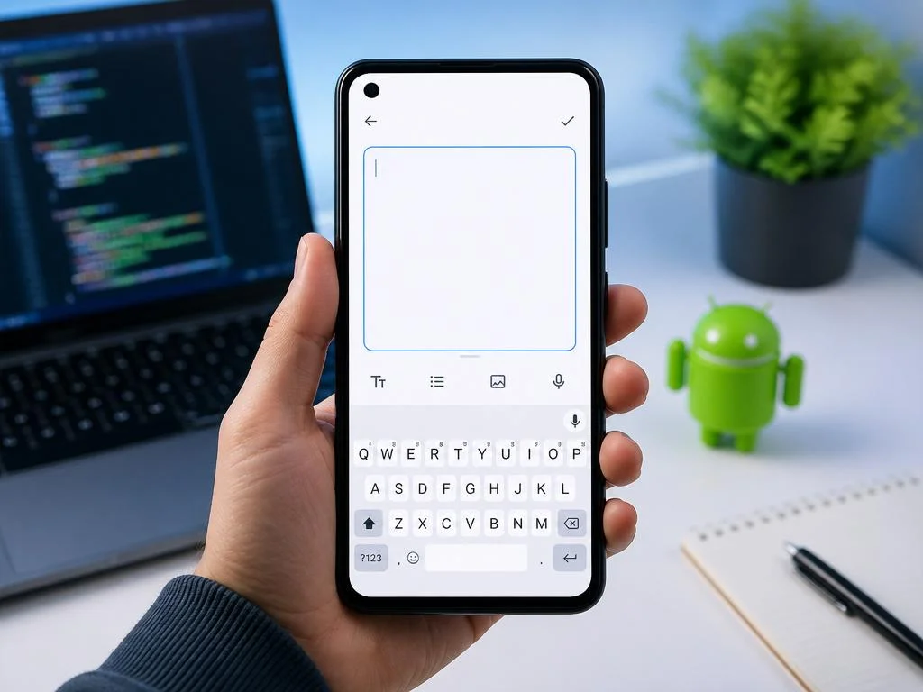
Creating a functional mobile application requires intuitive interfaces that accommodate rich textual input. Developers often configure the android edittext multiline component to let users type long notes, comments, or feedback seamlessly. Properly implementing this multi-line input field ensures that your layouts remain visually stable and highly responsive.
Optimizing this element involves mastering keyboard actions, scroll properties, and proper container dimensions. Understanding these dynamic settings will significantly elevate your application interface. Explore our comprehensive guide to discover critical strategies, XML attributes, and usability tips that will make your input screens incredibly engaging and easy to use.
Understanding the android edittext multiline properties
When building modern mobile interfaces, text input fields are vital for gathering user information. The standard text field in the SDK is designed to handle single-line inputs by default. To allow users to write longer texts, developers must configure specific attributes.
Activating the multiline feature changes how the input field interacts with the soft keyboard. It modifies the enter key behavior, enabling users to create new lines rather than submitting the form. This adjustment is essential for building robust messaging screens or detailed feedback forms.
Developers must handle layout scaling carefully to prevent input fields from overlapping other interface components. When users enter extensive text, the container should expand gracefully within its parent view. Proper constraint definitions are necessary to keep the entire user interface balanced.
Essential xml attributes for multiline text fields
To enable multiple lines, you must set the input type attribute to textMultiLine. This primary setting tells the operating system to support line breaks. Without this configuration, the input field will restrict the user to a single, horizontally scrolling line of text.
Another critical parameter is the gravity attribute, which controls how text aligns inside the container. By default, multi-line text might align vertically centered, which looks unprofessional. Setting the gravity to top ensures that the text starts typing from the upper-left corner.
📊 Key XML Attributes Comparison
| Attribute Name | Default Value | Multiline Purpose |
|---|---|---|
| android:inputType | text | Enables carriage return and line wrapping |
| android:gravity | center_vertical | Aligns starting text to top-left |
| android:maxLines | infinite | Caps layout height after specified lines |
Adding these visual configurations provides a highly professional appearance to your interface. Users instantly recognize where to begin typing their messages, reducing friction during form completion. We can learn from enterprise performance solutions that value simplicity in software design.
Enhancing user experience for text input fields
Designing intuitive user input fields involves much more than just enabling line breaks. You must consider how the application responds to different screen orientations and keyboard types. A poorly configured input area can easily cover crucial buttons, frustrating your active users.
To prevent these issues, developers should combine soft keyboard configurations with scrollable containers. When the virtual keyboard appears, the layout should adjust to keep the active input visible. This seamless transition is critical for maintaining high engagement rates in modern mobile apps.
Well-implemented text fields also improve conversion rates by minimizing user input errors. When users can easily review their entire message, they feel more confident in submitting form data. This positive user experience directly impacts retention and drives substantial online revenue growth through better customer satisfaction.
Managing keyboard behaviors and action buttons
The virtual keyboard action button, often known as the IME option, requires careful setup. In single-line inputs, this button usually triggers a “Done” or “Next” action. For a multi-line setup, however, the button must function as a return key to insert new lines.
You can customize this behavior programmatically using listener interfaces in your controller classes. By capturing key events, you can decide when to submit the form or add spacing. This flexibility allows developers to create highly customized input behaviors for specialized applications.
💡 Pro Tip: Handling IME Options
To force a multiline text field to show a “Send” or “Done” action on the keyboard instead of a carriage return, use the attribute android:imeOptions="actionSend" combined with your multiline input type. This ensures smooth navigation while preserving multiline formatting.
Managing these subtle keyboard details ensures that your software feels incredibly polished. Users appreciate interfaces that behave predictably and adapt to their typing habits without unexpected jumps. These minor details differentiate exceptional applications from average ones in crowded marketplaces.
How to restrict lines in android edittext multiline
While allowing multiple lines is beneficial, you must avoid letting an input field expand indefinitely. An unlimited text area can push other essential layout elements off the screen entirely. Restricting the maximum dimension of the android edittext multiline component resolves this design challenge.
By setting specific limitations, you maintain complete control over your application’s visual structure. The input container will expand to a certain limit and then enable internal scrolling. This behavior preserves the layout integrity while still accommodating extensive textual descriptions from users.
Applying these boundary limits ensures that your layouts remain compact and readable on smaller devices. Users can scroll through their text comfortably without losing sight of submit buttons. This design pattern is standard across popular messaging and productivity tools.
Controlling maximum lines and scrollable views
The XML attributes maxLines and minLines are perfect tools for managing vertical layout growth. Setting a minimum line count ensures the text box is immediately recognizable as a multi-line area. Setting a maximum limit stops the vertical expansion once the threshold is crossed.
When the text exceeds the maximum lines, vertical scrollbars should appear to guide the user. You can enable scrollbars by adding the scrollbars attribute to your XML definition. This simple addition makes the scrollable state obvious, improving overall text navigation.
⚠️ Warning: Avoid Hardcoding Layout Height
Do not set android:layout_height to a fixed pixel value when configuring a multi-line field. Instead, use wrap_content combined with maximum constraints to enable healthy development practices.
Following this practice keeps your design fluid and responsive across thousands of Android device screen resolutions. It prevents text clipping, overlapping, and other common rendering bugs. This clean configuration makes your layout robust and ready for any device size without setting a healthy dynamic layout scaling rule.
Improving accessibility in text input components

Accessibility is a core pillar of modern application design that developers should never overlook. For users with visual impairments, a multi-line input must interact correctly with screen readers. Providing clear descriptions and labels ensures that everyone can navigate your form inputs easily.
Setting the content description attribute helps assistive technologies explain the purpose of the input. When a screen reader focuses on the multi-line field, it reads the label aloud. This clear communication makes your mobile interface inclusive and user-friendly for all audiences.
In addition, screen readers rely heavily on logical navigation hierarchies to guide users through form fields. Sticking to standard layout components ensures that your fields are ordered correctly during navigation. This predictable flow is vital for building accessible, high-quality digital experiences.
Providing helpful focus states and clear hints
Clear visual hints inside the empty text box guide users on what information to enter. Once the user taps the field, the hint should disappear or move elegantly to make room. This interactive feedback loop helps users complete forms without hesitation.
Dynamic focus states, indicated by changing border colors or subtle shadows, highlight the active input field. This visual feedback tells the user exactly where their typed characters will appear. Creating these clear highlights is essential for optimizing mobile forms and preventing input errors.
✅ Accessibility & UX Checklist
- Always set a descriptive hint instead of leaving fields blank.
- Ensure a minimum touch target size of 48dp for the container.
- Test with screen readers to verify layout logical order.
- Highlight focus states using highly distinctive, accessible color contrasts.
These micro-interactions significantly elevate the perceived quality of your digital product. When users feel guided at every step, they are much more likely to complete registrations or purchases. The resulting ease of use forms the foundation of modern interface design standards.
Styling your text input container beautifully
Modern users expect applications to be visually stunning and highly polished. Plain text inputs can look dated and unengaging, which might decrease user interaction rates. Customizing your input containers with gradients, rounded corners, and subtle borders makes them look incredibly professional.
You can design custom XML drawable resources to serve as background layers for inputs. These resources allow you to define different states, such as focused, enabled, or disabled. When the state changes, the background updates automatically, giving instant feedback to the user.
Integrating these refined designs into your product interface captures attention instantly. Visual styling plays an important role in establishing brand identity and trust. Beautiful interfaces make applications look trustworthy, similar to how modern digital tools display real-time feeds with great visual appeal.
Customizing backgrounds and dynamic indicators
Adding a real-time character counter below your input box is a great design pattern. It lets users know how much space they have left for their text. This feature is particularly helpful for fields with strict length limits, like bios or comments.
You can implement this counter by using a text watcher listener in your activity code. The listener counts the characters dynamically and updates a small text view below the input. This interactive element keeps users informed and prevents them from exceeding database limits.
ℹ️ Dynamic Character Counting
Combine a TextInputLayout from the Material Design library with your multiline text field. By setting counter attributes, you automatically get a beautifully styled character counter without writing manual listener code.
Using these built-in material components saves development time and ensures design consistency. The components follow modern design guidelines, offering smooth animations and native visual polish out of the box. Incorporating them is the easiest way to modernize your user interface.
Transitioning from legacy xml views to modern layouts
Mobile development is constantly evolving, requiring engineers to update old layout paradigms. Transitioning from legacy UI elements to flexible, scalable layouts keeps your codebase maintainable. This modernization allows you to implement complex designs without adding performance bottlenecks to your rendering system.
While legacy layouts still function, adopting modern patterns ensures your application remains compatible with future updates. It allows you to use powerful styling capabilities and advanced animation frameworks. Ultimately, adopting robust digital growth strategies ensures your applications scale effectively.
Keeping your user interface layers clean makes onboarding new developers to the team easy. It reduces technical debt and makes bug fixing much more straightforward. A well-organized codebase is the foundation of any successful, long-term mobile software project.
Writing clean code with proper layout parameters
Clean XML layout files should avoid redundant nests of view groups to maximize performance. Using flat view hierarchies, like constraint layouts, helps render complex screens quickly. It ensures that your input elements remain perfectly aligned, regardless of the device’s screen aspect ratio.
Organizing your attributes alphabetically or by category also improves layout file readability. Grouping layout properties, styling properties, and functional settings helps you maintain files easily. This structured approach to writing layout code benefits both individual developers and large teams.
Collaborating closely with UX designers during the initial wireframing phase helps identify potential layout bottlenecks early. Designers can mock up how the multi-line elements look when active, empty, or error-prone. This proactive planning prevents costly layout redesigns later in the production lifecycle.
In conclusion, crafting an amazing multiline text input experience is an art that combines technical knowledge and design empathy. By mastering the settings discussed in this guide, you can create delightful forms that your users will enjoy filling out. Happy coding on your next mobile project!
Testing input fields across multiple android devices
Automated UI tests can verify how text containers behave under large text scenarios. You can write Espresso tests to enter a long paragraph programmatically and assert that the layout does not break. This automated verification keeps your interface stable across subsequent code updates.
Manual testing on real devices remains vital to assess the real typing experience. Check how different third-party keyboard apps interact with your inputs, as some might have custom suggestions or autocorrect overlays. Ensuring compatibility with these keyboards protects your app from unexpected interface bugs.
Emulating different system font sizes and display scales
Testing under accessibility settings, such as enlarged system font sizes, is also highly recommended. When users increase their system font, text components must scale gracefully without clipping contents. Verifying these configurations ensures your application remains inclusive and perfectly usable for everyone.
