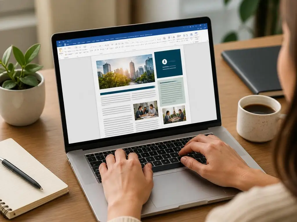
Designing a beautiful digital bulletin does not require expensive publishing software. You can easily use Microsoft Office to build amazing layouts for your readers. In this guide, you will discover how to create a newsletter in Word using simple techniques that yield highly professional results for any target audience.
By mastering a few core alignment tools and page properties, you can transform a plain document into an engaging masterpiece. Let us explore the precise steps and design principles needed to grab attention, format your content cleanly, and keep your subscribers excited for every new update you publish.
Why should you create a newsletter in Word today?
Utilizing familiar document processing software offers incredible flexibility for small businesses and independent creators. You do not need a subscription to complex graphic design suites to share your stories. Microsoft Word provides a robust collection of layout features that allow you to customize text, manipulate shapes, and organize articles with extreme precision.
Furthermore, utilizing this software ensures that your team can collaborate easily on content creation. Most professionals already know how to navigate the interface, which minimizes the learning curve significantly. It represents a cost-effective, accessible, and surprisingly powerful solution for producing regular communication materials without outsourcing the work.
How to set up your page layout for clean designs
Before typing any articles, you must prepare your canvas to prevent formatting issues later on. Start by opening a fresh document and adjusting the orientation to portrait or landscape depending on your chosen structural concept. This initial setup is crucial for establishing the boundaries of your digital communication project.
Next, you need to configure the margins to maximize the usable space on each page. Indeed, narrow margins are typically ideal for bulletins because they allow more room for columns, images, and decorative borders. Making these adjustments immediately guarantees that your elements will fit together harmoniously without unexpected page breaks.
Choosing the right dimensions and margins
Standard layouts generally look best when you set the margins to exactly half an inch on all sides. This gives you a balanced border that prevents text from feeling crowded near the edges. It also leaves enough whitespace to maintain a clean, readable appearance that looks highly polished.
You should also consider whether your final product will be printed or sent electronically. If you plan to distribute it primarily via email, standard letter size works beautifully. For digital setups, you might also explore how a specific OS environment affects your workflow, such as seeing if Windows 10 Pro N suits your system.
Using columns to create a newsletter in Word layout
Dividing your document into columns is the secret to achieving a classic newspaper appearance. This formatting choice makes long blocks of text much easier for your readers to scan quickly. Word allows you to split your pages into two or three vertical columns with a single click.
To do this, navigate to the layout tab, select the columns drop-down menu, and choose your preferred division. You can customize the width of each column and even insert a subtle vertical line between them. This structured division helps separate distinct stories and keeps your layout looking organized.
💡 Column selection quick guide
Use a two-column setup for brief bulletins containing large graphics, as this leaves spacious room for rich media. Opt for three columns if you are publishing dense news reports with shorter articles to maximize readability and page economy.
Step-by-step guide to adding modern visual elements
A text-heavy document will quickly lose the interest of your audience. To maintain engagement, you must integrate visual components that break up the text and guide the reader’s eye. This involves using modern icons, custom illustrations, and colorful dividers that segment different topics within your publication.
Adding these items requires a careful touch to prevent the page from looking cluttered. You must ensure that every visual element has a clear purpose and complements the overall theme. Let us explore the exact steps to insert these design components without disrupting your existing text flow.
Inserting text boxes and custom headers
Text boxes are incredibly useful tools because they allow you to place paragraphs anywhere on the canvas. Unlike standard paragraph alignment, a text box can override normal grid restrictions. This gives you the freedom to create pull quotes, sidebars, or beautiful promotional announcements that stand out.
To create a cohesive look, you should also construct a striking header at the top of the page. This header acts as the masthead of your bulletin, containing the title, issue number, and publication date. A well-designed header immediately establishes your brand identity and sets a professional tone.
Working with high-quality images and shapes
High-resolution photos can dramatically elevate the quality of your publication. When inserting images, remember to adjust the text-wrapping settings to keep your layout organized. Using the square or tight wrap setting allows your written content to flow beautifully around the borders of your graphics.
You can also use simple geometric shapes to build colorful background accents or custom section dividers. Drawing a thin colored rectangle directly under your major headings adds a brilliant modern touch to the page. These minor structural details separate professional designs from basic, uninspired documents created by standard office workers.
⚠️ Format warning: Watch your anchor settings
When placing custom shapes and pictures next to text boxes, always set their wrap type to ‘Square’ or ‘Tight’ and anchor them directly to the paragraph. This prevents items from sliding or overlapping when text is added later.
What are the best formatting tricks for readability?
Readability should always be your top priority when designing any informational publication. If your subscribers struggle to read your articles, they will quickly close the document. Achieving high readability requires balancing your typography choices, spacing options, and the smart distribution of empty spaces across your entire canvas.
First, you must use clean fonts that look professional and are easy on the eyes. Sans-serif typefaces like Arial, Calibri, or Segoe UI are excellent choices for modern digital publications. Avoid using overly decorative fonts for your main paragraphs, as they quickly cause eye strain during longer reading sessions.
Second, pay close attention to the line spacing of your paragraphs. Setting your line spacing to exactly 1.15 or 1.5 provides breathing room between the sentences. This prevents the text from looking like a solid block of ink, which makes scanning the document far more enjoyable.
Third, maintain consistent font sizes throughout your entire layout. Your main title should be the largest element, followed by distinct heading sizes and a standard size for your body text. This visual hierarchy helps readers understand the structural flow of your news updates instantly.
| Element type | Recommended font size | Best practice guidelines |
|---|---|---|
| Main title (Masthead) | 28pt to 36pt | Keep it bold, centered, and highly visible at the absolute top of page one. |
| Section headings (H2) | 16pt to 20pt | Use a clean accent color that aligns with your primary corporate brand identity. |
| Body text paragraphs | 10pt to 11.5pt | Maintain standard black or dark grey coloring with generous line spacing. |
Saving and exporting your personal newsletter template
Once you have crafted the perfect layout, you must save it correctly to preserve your hard work. Saving the file as a template allows you to reuse the identical design for future editions. This saves an enormous amount of time and guarantees brand consistency month after month.
To do this, click the file menu, choose save as, and select the document template format. The next time you need to publish an issue, simply open this template and swap out the old text and images. Your structural margins and custom styles will remain completely untouched.
Furthermore, you should export your final product as a high-quality PDF before sending it to your subscribers. A PDF file locks all your formatting in place, ensuring that your layout looks exactly the same on any device. It prevents formatting shifts that often occur when opening Word files on different operating systems.
Additionally, managing your internal workflow correctly is just as important as producing beautiful publications. For example, learning how to organize your inbox can help you manage subscriber feedback and keep track of content contributions from your coworkers.
“A high-quality bulletin is not judged by how many decorative elements you can squeeze onto the page, but by how cleanly and efficiently you convey critical information to your reader.”
Managing design workflows and essential business files
Producing a monthly publication requires coordination, content collection, and careful administrative planning. If you work in a corporate environment, you might face structural adjustments that impact your work productivity. It is essential to understand your professional environment, especially during times of organizational changes or transition periods.
For instance, changes in your compensation or contract structure can distract you from your creative projects. If you are experiencing structural modifications at work, you should research salary reduction rights to protect your professional interests. Staying informed about your corporate standing allows you to focus on your creative output with complete peace of mind.
Likewise, dealing with unexpected administrative challenges requires swift, decisive action to avoid unnecessary stress. Knowing what steps to take during sudden contract adjustments is crucial for any modern employee. You can explore how to handle these situations by discovering what legal steps are available to safeguard your career pathway.
Having this legal and administrative clarity ensures that your focus remains entirely on your creative projects. A peaceful mind translates directly into higher productivity and better design decisions. You can dedicate your energy to writing engaging articles and creating visually spectacular bulletins that delight your entire audience.
Final design tips for creating a stunning email bulletin
To make your communication piece truly memorable, you must focus on the subtle details that elevate standard layouts. Use high-contrast color schemes that align with your brand guidelines but remain easy on the reader’s eyes. A dark blue header paired with clean white background elements always looks incredibly sharp.
Remember to leave plenty of whitespace around your visual elements to give your design room to breathe. Crowded pages feel overwhelming and often discourage readers from finishing your articles. Balancing text columns with empty space creates a natural visual flow that feels incredibly professional and elegant.
Before hitting the send button, always print a physical proof or send a digital draft to a colleague. Having another set of eyes check your layout helps catch hidden alignment issues or spelling mistakes. It is the final quality check that ensures your publication meets the highest possible standards.
✔️ Design check checklist
- Verify margins are set to exactly 0.5 inches on all borders.
- Check that all integrated image wraps are locked to square text flow.
- Ensure interactive hyperlinks point to working external addresses.
- Confirm total color count does not exceed three dominant tones.
How to design custom headers and beautiful banners
The top section of your bulletin is the first thing your subscribers see, making it the most critical part of your design. You must design a header that immediately communicates your brand name, logo, and the theme of the current issue. A strong visual header sets the tone for everything that follows.
To build this in Microsoft Office, you can insert a colored shape that spans the entire width of your margins. Layer a clean, bold title over this colored block using a contrasting font color such as white or bright gold. Add small, subtle text boxes below for the date and edition details.
This simple layered design approach creates a highly professional banner without needing advanced editing software. It establishes clear visual boundaries and instantly draws the reader’s eye to your primary publication title. Consistent banner designs build strong brand recognition over time, ensuring your audience always recognizes your work.
Managing color palettes for professional design styling
A messy color palette can quickly ruin a well-structured document, making it look chaotic and hard to read. You should limit your design to three primary colors that complement each other and reflect your corporate identity. A dominant color, a secondary accent color, and a neutral background color are all you need.
Use your dominant color for major headings, shapes, and structural borders to create visual consistency throughout the pages. Your secondary accent color should be reserved for highlighting special callouts, links, or specific buttons. This strict color hierarchy guides the reader’s eye naturally from one section to the next.
Keep your main content background completely white or light gray to ensure maximum contrast with your black text. Dark backgrounds with light text can be highly fatiguing to read over long periods of time. Prioritizing reading comfort over artistic flair ensures your audience reads your publication from beginning to end.
Including interactive links and navigation elements
Since most newsletters are distributed digitally, you should take full advantage of interactive elements in your document. You can easily embed hyperlinks to your website, blog posts, or social media profiles directly into your articles. This simple interactive approach helps drive valuable traffic directly to your primary online platforms.
When adding links, ensure your anchor text is clear, descriptive, and seamlessly integrated into your sentence structure. Avoid writing messy, raw URLs that clutter your layout and look highly unprofessional on the page. Use contrasting colors to make your interactive links stand out from the surrounding body text.
You can also construct a simple table of contents at the beginning of longer multi-page bulletins. Word allows you to link these table entries directly to specific headings within the document itself. This enables readers to jump straight to the stories that interest them most with one single click.
